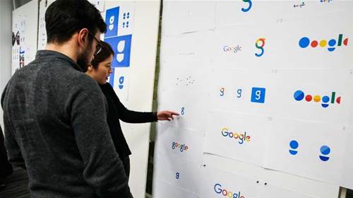
Weeks after a corporate restructure, Google has made the biggest change to its logo in 16 years, adopting a sans-serif typeface for a cleaner look that is also more practical for multi-platform use.
Google introduced the change via an animated doodle on its search page.
What is immediately clear is the lack of serifs – the small, decorative lines attached to the end of the letters.
There’s a bit of a religious argument in design over whether serif or sans-serif (literally, ‘without serif’) typefaces are easier to read on the web.
But there are a number of reasons why Google has made the change.
Gizmodo breaks down some of the design reasons to switch to sans-serif, including that the logo scales better on the range of screen sizes from where Google services are now consumed, and that the new logo chews up far less bandwidth to load.
And Google’s own design team shed further light on the size advantages of its new sans-serif font.
Users connecting to Google over low-bandwidth links previously saw a slightly different logo than those on higher-bandwidth connections – mainly because the old logo was around “14,000 bytes” in size.
The company has now been able to build “a special variant of our full-colour logo that is only 305 bytes".
“The old logo, with its intricate serifs and larger file size, required that we serve a text-based approximation of the logo for low bandwidth connections,” Google Design said.
“The new logo’s reduced file size avoids this workaround and the consistency has tremendous impact when you consider our goal of making Google more accessible and useful to users around the world, including the next billion.”
It’s not just the full ‘Google’ logo that has been redesigned but also the shortened blue ‘g’, which has been replaced by a four-colour capital ‘G’.


